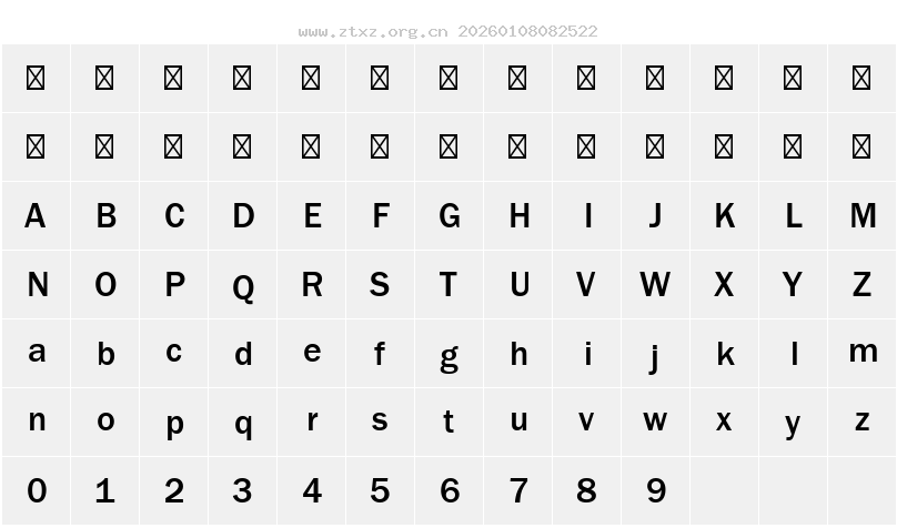
字体预览图

字体资讯
- 字体名称: ITCFranklinGothic LT Pro Md
- 字体风格: Regular
- 字体标识: ITC - ITC Franklin Gothic LT Pro Medium
- 字体全称: ITCFranklinGothic LT Pro Md
- 版本: Version 2.000 Build 1000
- 字重: 400
- PostScript名称: FranklinGothicLTPro-Md
- 字符数量: 372
- 版权: Copyright © 2014 Monotype ITC Inc. All rights reserved.
- 设计师: Vic Caruso
- 制造商: Monotype ITC Inc.
- 描述: Franklin Gothic was designed by Morris Fuller Benton for the American Type Founders Company in 1903-1912. There were already many gothics in America in the early 1900s, but Benton was probably influenced by the popular German grotesks: Basic Commercial and Reform from D. Stempel AG. Early types without serifs were known by the misnomer "gothic" in America ("grotesque" in Britain and "grotesk" in Germany). Franklin Gothic may have been named for Benjamin Franklin, though the design has no historical relationship to that famous early American printer and statesman. Benton was a prolific designer, and he designed several other sans serif fonts, including Alternate Gothic, Lightline Gothic and News Gothic. Recognizable aspects of Franklin Gothic include the two-story a and g, subtle stroke contrast, and the thinning of round strokes as they merge into stems. The type appears dark and monotone overall, giving it a robustly modern look. Franklin Gothic is still one of the most widely used sans serifs; it's a suitable choice for newspapers, advertising and posters. ITC Franklin Gothic® is a large set of fonts based on Benton's work, with two skilled artisans behind the revival and expansion. In 1980, Victor Caruso re-drew the original Franklin Gothic and designed several more weights, and in 1991, David Berlow added several condensed and compressed weights. With dozens of weights and styles, this perennial favorite is ready for duty in any situation from tight corners on printed documents to powerhouse arenas on websites. Another family with a similarly useful design is Trade Gothic.
字符映射图
Tags:ttfLightRegularMediumGothic